Wadden Sea Centre
Tactile museum exhibition in UNESCO heritage site
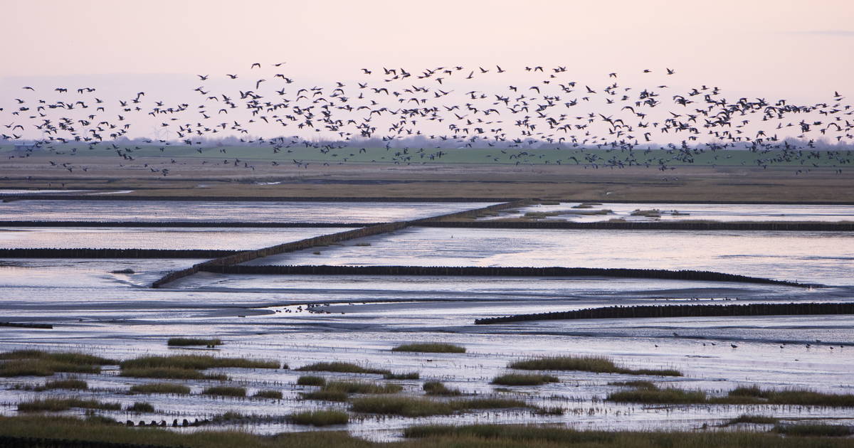
Located on the west coast of Southern Jutland is the worlds largest unbroken system of intertidal sands and mudflats. Stretching from the Netherlands, through Germany up to the Danish coast, this unique eco system is home to a large and diverse group of flora and fauna. Every year 15 million migratory birds make a stopover before continuing their long journeys north and south, making this area one of the most important natural sites of Europe. This is also one of the last remaining large scale intertidal eco systems where natural processes continue to function largely undisturbed.
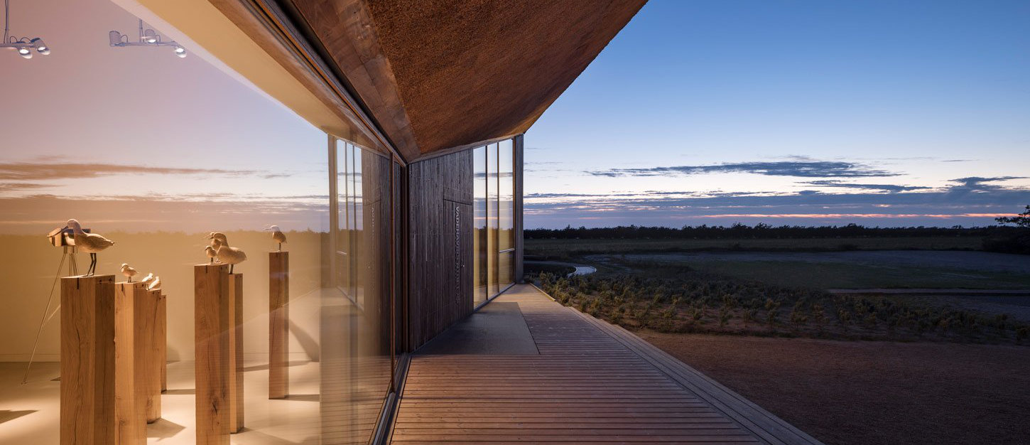
Right on the coast is the Wadden Sea Centre, which for years has taken the role of educator, facilitation trips to the mudflats. In 2013 an new building drawn by Dorte Mandrup started construction, and would expand the locales from 400m2 to 2800m2, with classrooms, service area, meeting rooms and a café. For the new exhibition being planned, No Parking together with JAC Studios won the bid and would assume responsibility for transforming 1000m2 of empty space into a tactile experience of light, sound and interaction.
The purpose of the exhibition was educational. Conveying the diversity, complexity and importance of this natural site through layered storytelling, modern technology and classic craftsmanship. Tactility and interaction would be key in driving the visitor engagement and ensuring the educational content was approachable. Clarity and sensitivity in the communication and design would leave room for contemplation and reflection. We wanted to draw visitors in to this total experience where the scenography combined with the storytelling and technology would encompass them, excite them, and inspire them to go out into nature and explore the landscape.
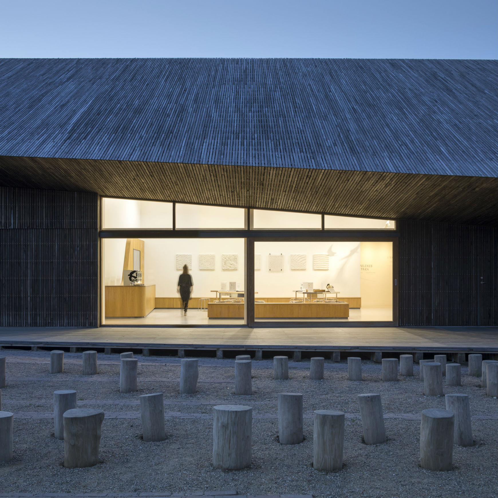
Foto: Adam Mørk

Installations
Part of my responsibility was setting up and aligning various projections found throughout the exhibition. These consisted of footage shot by nature photographer Jan Tandrup. Hours of footage was reviewed and cut down in Premier Pro, to finally be composited together and run in Watchout. Sound designer Philip Gabriel created a soundscape matching the ambience for each room in the exhibition.


Another responsibility was designing UI elements for the multiple screens and buttons throughout the exhibition. All The Way To Paris created the wayfinding and overall designs, and together we were able adapt those ideas into functional UI’s that drew inspiration from surrounding landscape and blended seamlessly with the materials and architecture. The starting point was a simple line, symbolising the ever present horizon on the mudflats. Carl Christian Tofte would be creating several beautiful watercolours, that would greatly influence the overall style and tone. My role in No Parking ment I would help other team members with their work, ensuring a consistent presentation throughout the exhibition.


To show the enormous distances migratory birds travel each season, we built a globe and projected all major bird routes on to it. On a technical level, this was a challenging project in terms of the mapping. We settled on using a polygonal globe, as we could more effectively flatten the mesh and warp the projection as needed. For this we used Watchout, which allowed us to create a scene in 3D space and calculate the viewing angles of the three projectors needed to cover the entire globe. This was a process of extensive testing on different materials and scale replicas. Finally we built a 1:1 cardboard model and used that to prep everything.
Besides the technical aspects, we also needed to create an 8 minute presentation that would serve as the center piece of the room. To fully appreciate the scale and distances, visitors would need to physically move around the globe and follow the different birds on their routes. A lot of work was also done on-sight in collaboration with the lighting designer Nikolaj Birkelund, to make sure the mapping was displayed optimally without needing to take anything away from the room lighting. All this was done while construction on the building itself was still going on around us, resulting in constant vibrations and shifting projector mounts. In the end, the result was worth the effort, and the globe ended up attracting a lot of attention from visitors.


The wadden sea is a landscape in motion. It constantly shifts and can change dramatically over the course of a few hours. Sitting on the edge of the North Sea, it has also seen it’s fair share of storms and floods.
We wanted to give visitors a tangible birds eyes perspective of the landscape and very purposely wanted to avoid adding another screen to the room. The solution was a wood carved topographic table, which we would project the shifting landscape onto. The table would run a loop marking out all the mudflats, marshes, creeks, levees etc. But it would also have 4 different scenarios triggered with physical buttons. These would showcase unique weather occurrences, like a strong eastwind pushing water out to sea, or the effects of a 4 meter storm surge with or without the levees.


A projector hidden over a mirror plane would project through the glass down onto the table, elegantly hiding the electronics. The visuals were created with a mix of After Effects and Photoshop, and put together with a combination of Watchout and Unity. Throughout the process I was in close feedback loops with the Museum making sure I marked everything out correctly, and working with ATWTP we were able to lock down a visual style. There’s was a challenge in accommodating the creative differences between project leads, an ongoing discussion of natural vs stylistic representation concerning this specific installation. The solution was in the scenarios. I wanted a distinct visual shift to retain focus when activating a scenario. I also needed more contrast to properly comunicate flooding and the movement of water. By flipping colours, not only did it serve the storytelling purpose, it also accommodated both parties’ vision.
Sand goby animation
Right from the start, I knew I would have a significant workload in creating the several animations about the interlinking food chain in the wadden sea. Time and budget was limited, so it was important to establish an effective workflow from the start. My first steps was storyboarding the different shorts and ensuring accuracy by repeated meetings with museum director Klaus Melbye.


Establishing a style was done together with ATWTP. It was clear that the emphasis on hand drawn delicate lines would need to carry over to the animations, but there was also a request for a more naturalistic depiction, so the aim was to strike a balance. Everything was done with Photoshop and After Effects, using DUIK to create the complex rigs needed, and some additional scripting to achieve the “wiggly line” effect. Thankfully the thorough collaboration on storyboards meant we were able to produce these with minimal corrections. For the menu, we made a depiction of how the food “net” connects. Pressing the buttons not only starts the animation, but also highlights which species is dependant on which for survival.
Diatoms animation
One of the rooms of the exhibition covers birds anatomy, everything from their digestive system and metabolism to their bones and feathers. Among the specimens and plakarts are four small interactive screens.


To explain how airflow across wings create lift, we made a screen with a 3D bird flying through the air, with visitors needing to blow air into a small sensor to simulate the airflow under and over the wings. Another screen asks visitors to pull food or air into a birds mouth and see how it breaks down and travels through the body. To show the radical change the birds body goes through while migrating, we also made a screen with a simple slider, showing how the different internal organs change position and size. Finally a screen breaking down the different types of feathers and their functions. Made in collaboration with Søren Klok. Everything was created with a combination Unity, Blender, After Effects and Photoshop.
Bird feathers screen early prototype
Knowing the centre would be a family destination, it was important for us to provide engangment specifically for younger kids as well. This mindset is present throughout the entire exhibition, but it’s especially with the Bird DJ.
Players can activate 8 different birds, each with an authentic sound, mixed by sound designer Philip Gabriel. Some loop and some pulse, and by combing them you can create a multilayered beat with snares and base. Made with Unity.


The foraging game is another example of designing for a family experience. The purpose here is to communicate the race migratory birds undertake during their stop-over in the wadden sea. To continue their long journey they need to stock up on fat, so many bird species spend literally all day foraging. If they don’t manage to gain enough weight before they need to move on, they will likely not survive the journey. The game is controlled by four directional buttons, and and the rules are simple. Eat enough worms before the timer runs out, if not you won’t be able to move on. Made with Unity and Blender.


Three VR binoculars and ten wood carved birds. This installation is a nod to all the bird watchers who frequent the area. As the user pans the binoculars across the room, the birds come to life one by one. Each binocular has a compact tablet connected to a rotation sensor in the ball bearing. A 3D application simulates the room and places the ten 3D sculpted wooden birds in the exact locations as their physical counterparts. When the user looks at a specific bird, it transforms into an animated life like version of the wood carving. It’s a memorable and unique way of getting acquainted with the different species that inhabit the marshes. This installation was designed by Søren Klok, my responsibilities was assisting with texture work.


The Waddensea Centre was a great experience to work on. It was a long and at times tough process, with shifting deadlines and creative differences along the way. But thanks to a great team of dedicated people, I think we managed to create something unique.
I stepped into the process after some groundwork had already been done. This meant that rough ideas and installations had been on the drawing board for some time. My challenge was taking these ideas and making them work within the vision that architect Johan Carlsson had created for the exhibition. This was a lot of fun, and ATWTP were great in helping to define style and tone. This also meant that some existing designs would have to be scrapped and some paradigms challenged. This is not always a pleasant thing to do, but it was absolutely necessary for the project. Thankfully the people I got to work with were very talented and dedicated to the project, so getting them onboard with the changes was not a problem.
The second challenge was time management and budget constraints. We caught a lucky break, when the opening of the museum was pushed back due to construction issues on the site. I would probably have cut back on the scope a bit to ensure quality. Some features were underdeveloped as a result, for example the quiz game for the audio guide. Earlier research could have shown there would be little interest for this feature, and funds could have been allocated towards some of the interactive installation we knew would attract a lot of attention. My main takeaways are the importance of thorough research and planing, as well as strong design documentation for aligning the vision. Being able to kill the darlings, and explore better solutions is not always easy, but it is a necessity. Overall I’m very proud of what we managed to create with the limitations we had. The exhibition was well received, and is today one of the most visited attractions in Southern Denmark.


